Are You Influencing Consumer Behaviour with the Colour of Your Packaging?

Brands use colour to establish recognition among competitors in a sea of products.
But Psychologists and Marketing professionals have also linked a strong connection between colour associations and consumer buying behaviour, from understanding what the consumer interprets from the branding colour(s). When using colour correctly, it could noticeably boost sales and maintain a consistent brand image. But when used incorrectly, you could hinder the product’s success.
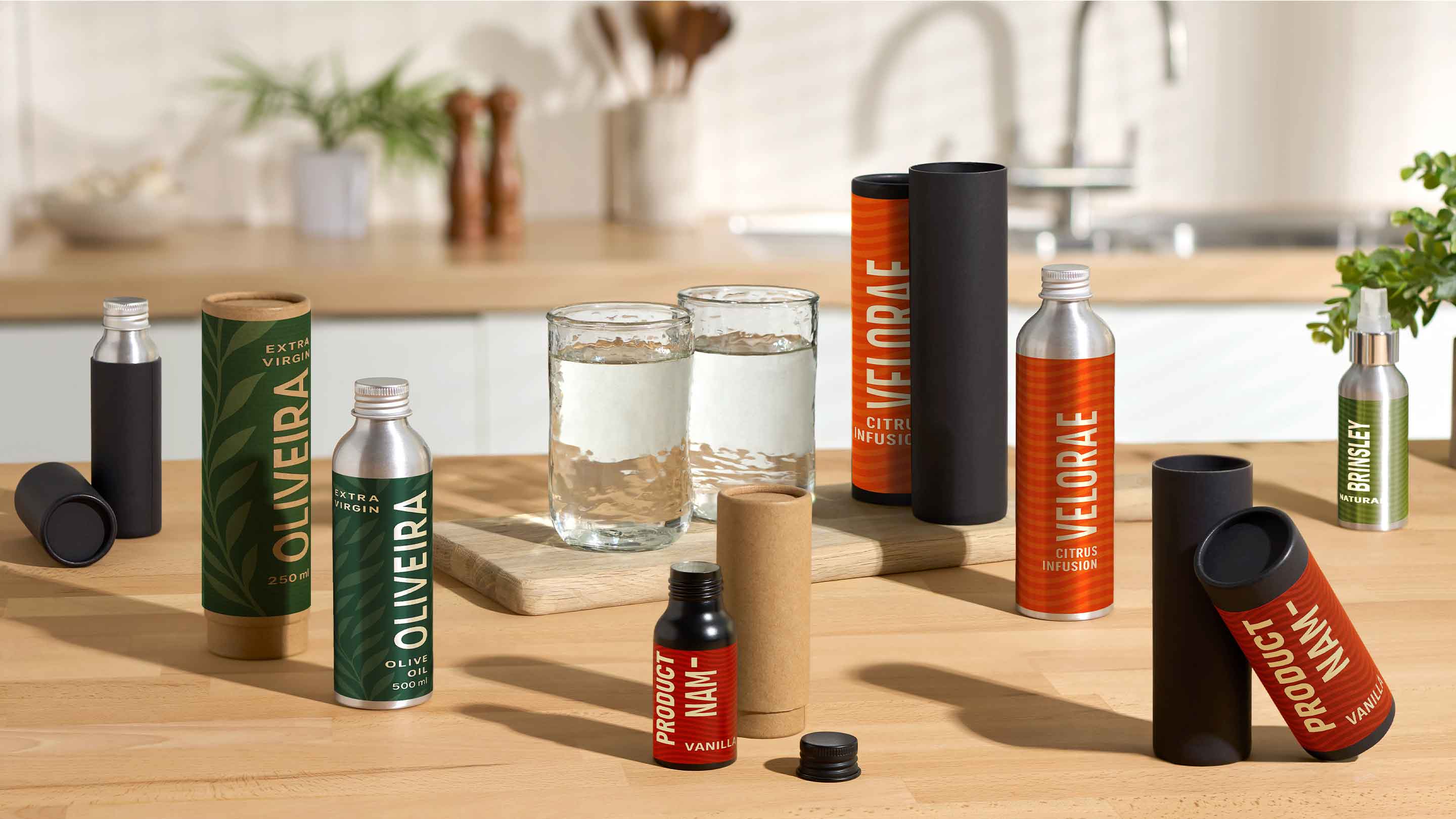
White
White portrays purity and simplicity, while giving a heightened perception of space. Products such as yoghurt, milk and cream also tend to favour white packaging as it complements natural ingredients and freshness. White also works well when accompanying other accent colours.
Black
In the past, dark packaging had many negative connotations (e.g. associated with mouldy food). However nowadays, if used effectively, it will create a sense of power and luxury. Apple’s on trend packaging combined with white promotes sophistication and exclusivity, supported by its expensive pricing.
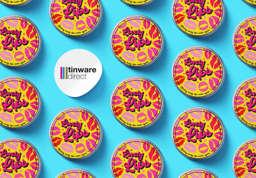
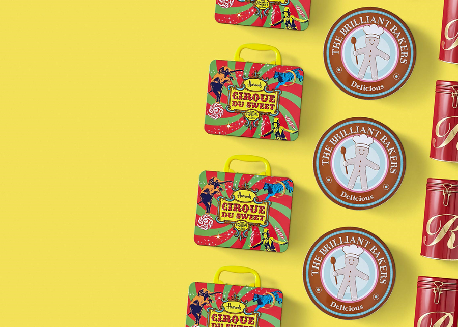
Red
Red is powerful and its main psychological attribute is excitement, increasing the heart rate and giving the impression that time is passing faster than it actually is, making it a popular choice for brands that target impulse buyers. Looking at fast food companies, McDonald’s, Burger King and KFC use red to convey urgency and speed, successfully corresponding with their brand image of fast and efficient food.
Yellow
Yellow encourages emotional feelings, often linked with optimism and friendliness. It is the easiest colour for the eyes to process, making it a good attention getter. Yellow is also an appetite stimulant, using both red and yellow together evokes taste buds, hence why fast food retailers such as McDonald’s and Burger King tend to use these colours hand in hand.
Orange
As a combination of red and yellow, orange produces similar stimulating effects of fun and passion. It also focuses our minds on food, which makes it another popular colour amongst food and beverage packaging.
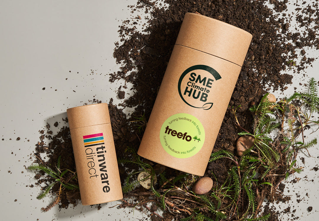
Green
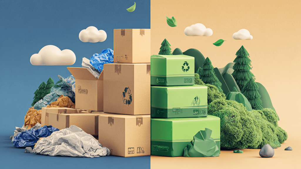
Green is associated with nature and the outdoors. It is the most suitable colour for emphasising wholesome natural ingredients, along with promoting a product in an environmentally friendly way.
Blue
Blue is primarily associated with cleanliness and trust, which is why dental products favour a light blue scheme to emphasise the promise of clean teeth. Royal blue is usually perceived conservatively and has a serious manner about it. Time and time again, research claims blue is the world’s favourite colour!
Determining a packaging colour scheme is a lengthy process that needs thorough research to be undertaken. A key point to note is that colours do not always possess the same meanings, so if your product is on a global scale, it’s important you understand other cultural perceptions. A strong understanding of your target audience and competitors’ is also imperative in gaining an advantage to produce successful packaging.