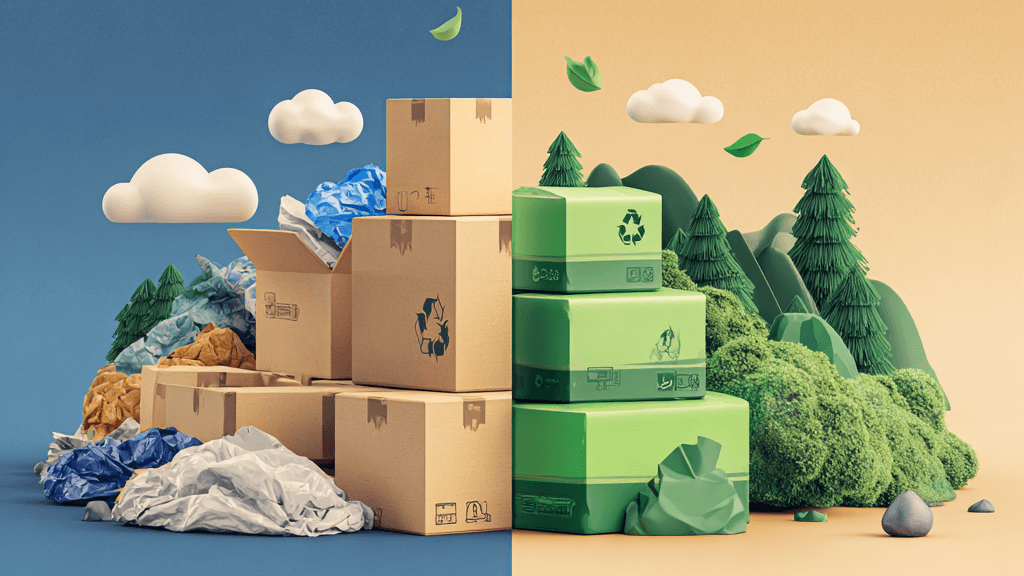
Colourful vs Minimalist Packaging

The personality of a brand is reflected in the design of its packaging. The design of a products packaging often provides a sense of identity, and helps to differentiate from the competition. Did you know? – one third of consumer decision making is based on packaging.
As packaging trends continue to change, minimalist packaging has seen a rise in popularity for both brands and consumers. But does this mean that brands should switch to simplistic designs? What is ultimately most effective for your brand, minimalist or elaborate?
What are pros and cons of colourful and minimalist packaging?
Colourful
What words do people associate with big, bold and colourful packaging?
- Fun
- Creative
- Confident
- Delicious
Brands exploding with colour and bold print on packaging will appear confident in their product and sure of the claims they make. The colours may also help increase appetite appeal by representing the flavours inside. A product that is bright on the shelf will also help achieve shelf stand out from a distance. Read about Psychological Responses to Packaging
Risks
When using colour, it is important to ensure the colours used don’t look too artificial as this can actually put people off. Anything too artificial will appear unhealthy. Another risk is the competition on the shelf potentially using bold colours too and you fading into the background. This is why its vitally important to have an extensive look at your competitors before you start designing your packaging.
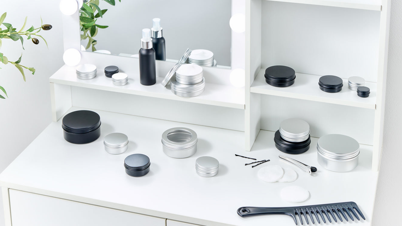
What words do people associate with minimalistic packaging?
- Luxury
- Simple
- Elegant
- Healthy
There are many different variants of minimalist packaging, from simplistic packaging to a design that is completely stripped back to just the brand name. There has definitely been a trend in simplistic packaging recently from chocolate bars to alcohol.
People often associate minimalistic packaging with premium. We’ve had many customers come to us and say they want their brand to appear professional so they want black, white and gold packaging. So, what are the risks of this?
Risks
Your first risk is not standing out on shelf. If your packaging is too simple and stripped back, there’s the chance that it may not stand out against your bolder competitors. If you want to position your brand as ‘premium’ but priced competitively, your customer may be put off by thinking it is far more expensive than it actually is at first glance.
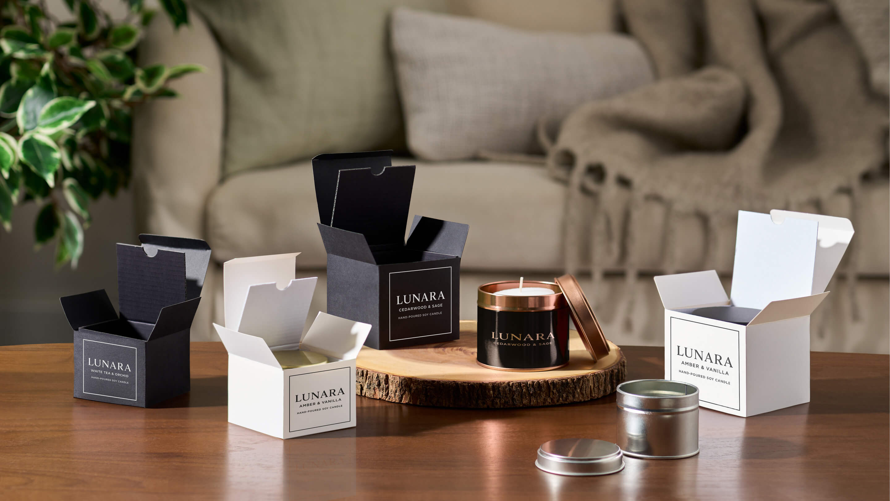
Examples of both
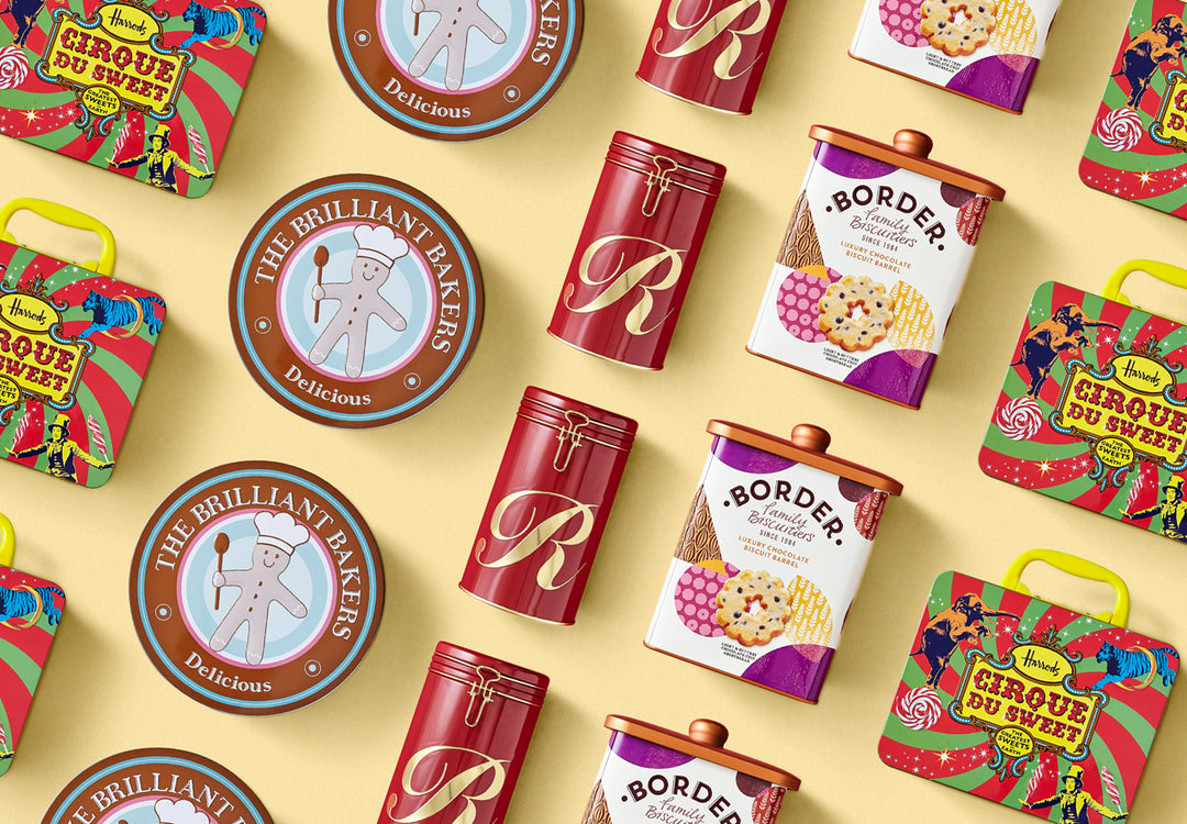
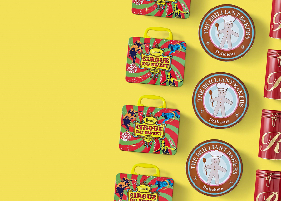
Harrods ‘Cirque Du Cookie’ is a prime example of elaborate and colourful packaging. The whole tin features an array of colours to match that of a circus environment with the tagline ‘the greatest cookies on earth’
Couteur Lingerie is an example of packaging that is very minimalist. The whole tin simply includes the brand name, logo and is finished in gloss to give off a ‘luxury’ feel.
In conclusion, there is no right or wrong option. You should work out exactly what your brand stands for and how you want consumers to see this.
Which type of packaging do you prefer? Let us know in the comments section.