How To Choose The Right Colour For Your Packaging

80% of the information we need to perceive the world is filtered through the eyes. This means that the sense of sight is the most important for communicating a message, as it takes precedence over all other senses. This is why visual cues on packaging are valuable tools to communicate information and branding to the customer.
Colour is one of these most important visual cues. Research by Colorcom suggests that consumers “make a subconscious judgment about a product within 90 seconds of initial viewing, and that between 62% and 90% of that assessment is based on colour alone.” A brand’s choice of colour is fundamental in reinforcing both its personality and the qualities of the products or services it offers, but how can we choose the right colour?
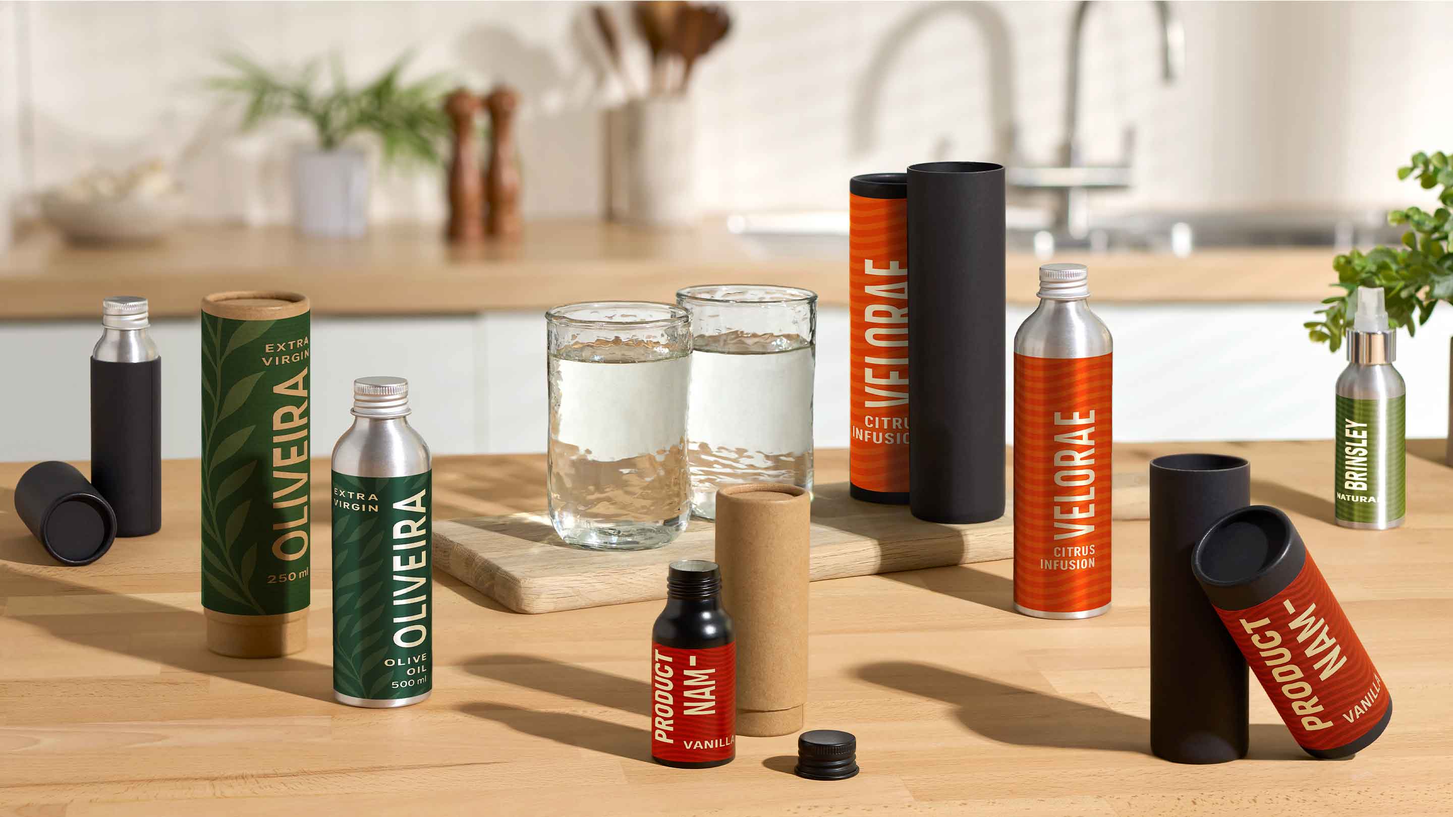
- Think of the consumer: When deciding on the colours to use on your packaging, you need to think of your target market. What is their age, gender, economic status, education? Your consumers should be able to connect with the colours you choose.
- Study your competition: Who are your main competitors? What colours do they use? You want your product to stand out from the competition. By choosing a colour that’s unique and contrasts with your competitors, this can help to give you the edge and ensure you have a better chance of getting your product noticed on the shelves.
- Your products purpose: You might want to use colour to demonstrate the purpose of the product. Is the product comforting? Is the product professional? Is the product fun? Different colours influence emotion in multiple ways, and can be used to demonstrate different purposes. For example, brighter colours tend to reduce the seriousness of packaging, which is why they are often used for toys.
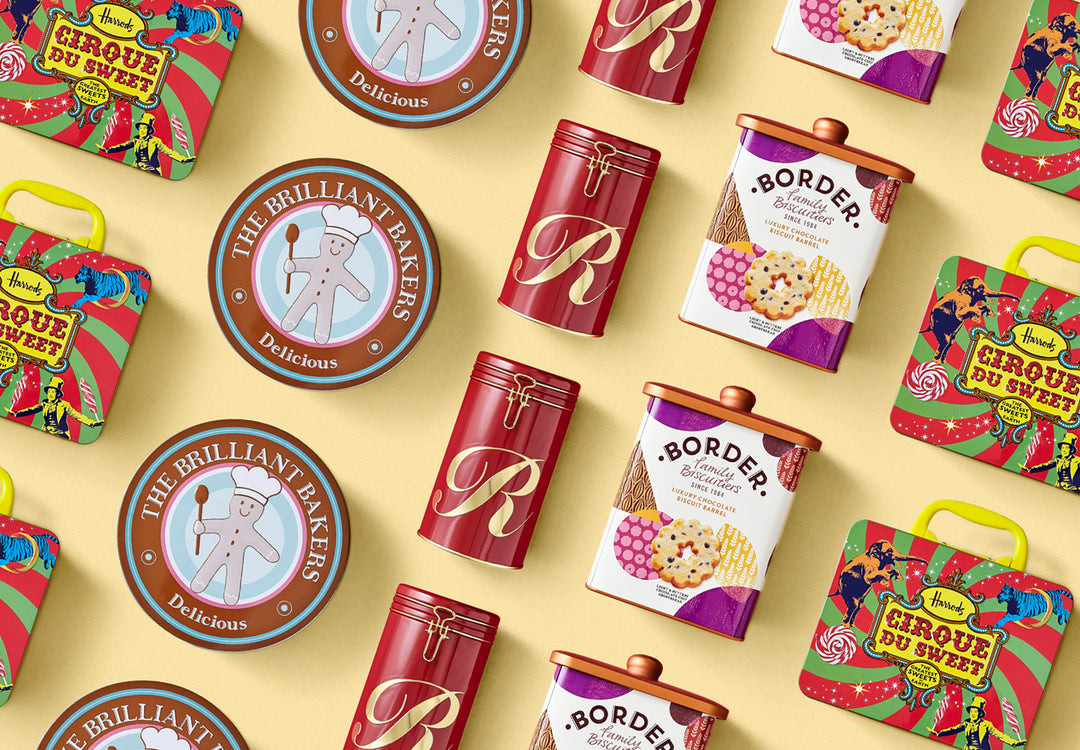
- Communicate your brand values: This is another opportunity for communicating your brands voice, and therefore your brand values also need to be demonstrated through colour. For example, as a premium brand, Apple’s use of white makes it appear luxurious.
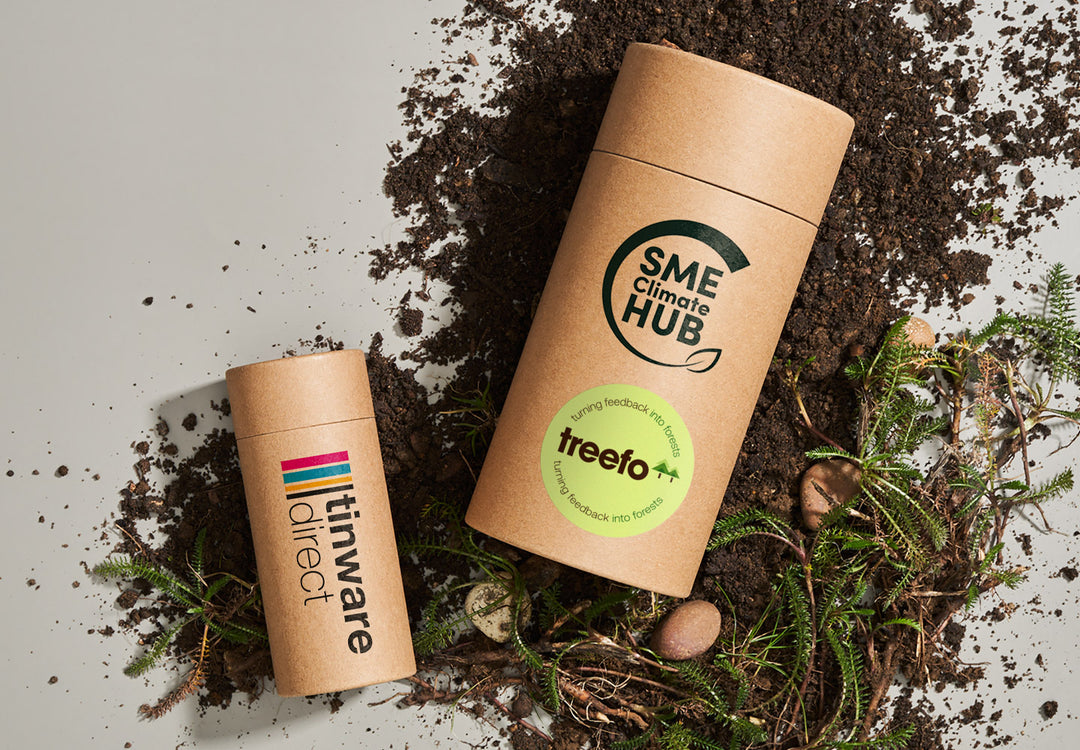
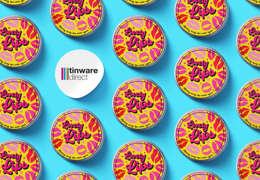
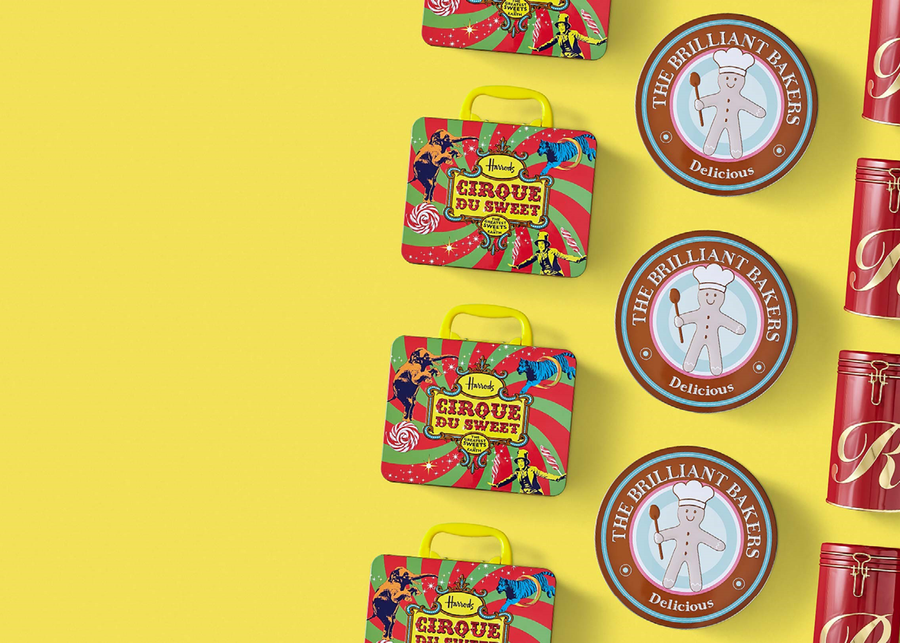
- Maintain consistency: It is important to maintain consistency on your packaging, and this can be achieved through the use of colour. This means that the consumer will be able to recognise your brand, no matter the shape or size of packaging. Some companies have even gone as far as trademarking their defining shades, such as Cadbury’s, which they apply to almost all of their packaging.
These tips can help guide you through the difficult process of choosing the colours for your packaging. The most important factor, however, is to keep your customers and brand at the forefront of this decision.
There are a lot more factors to be considered, such as printing technology, the nature of the printing surface, or the print finish. For more information or help on choosing the right colour for your packaging, please contact us.