Tinware Direct Reveals New Brand Identity

New look for Tinware Direct
Bedford based tin box packaging supplier, Tinware Direct revealed its new brand identity on Tuesday February 24th 2016 at the prestigious Packaging Innovations exhibition as part of a larger brand relaunch.
The successful Tinware Direct brand name remains the same but has been modernised to reflect the company’s core values.
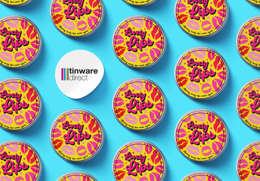
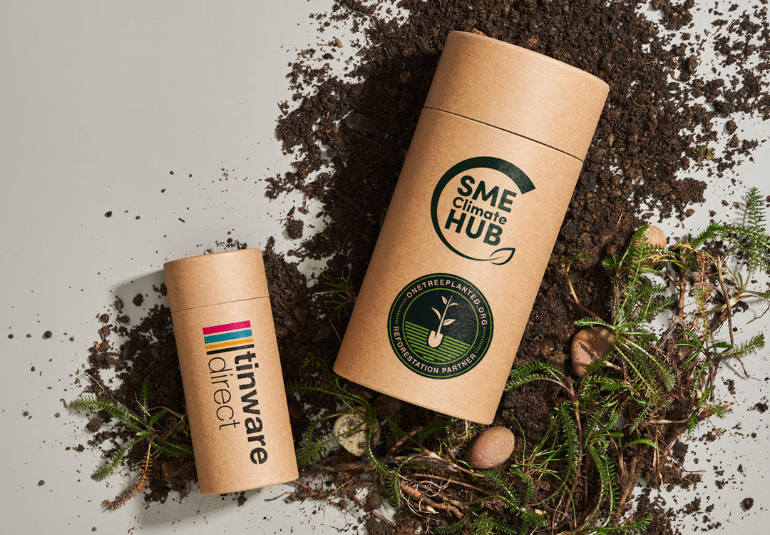
The visual identity of the icon was chosen to represent the four colour process used in the manufacturing process and the symbol itself represents containers, round and square, showing that containers are bespoke and made to fit the contents.
Managing Director of Tinware Direct, Guy Grumbridge said “We supply high quality packaging solutions which add value to our customer’s products and brand. We wanted our brand to reflect these values and it is also important that our brand is just as eye-catching as the packaging we supply”.
“Tinware Directs success is built on our ability to offer customers unrivalled service. Our rebrand reflects these qualities and the values we hold”.
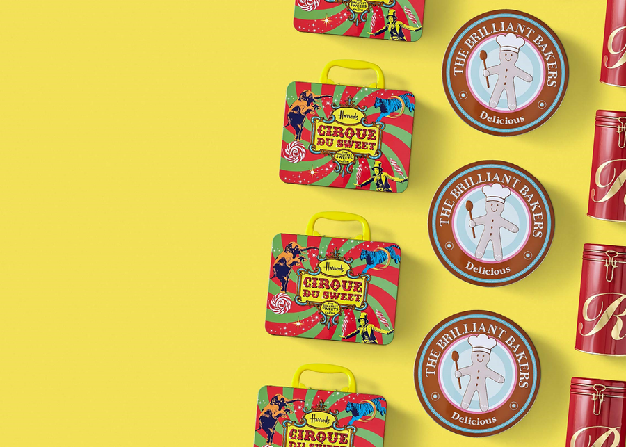
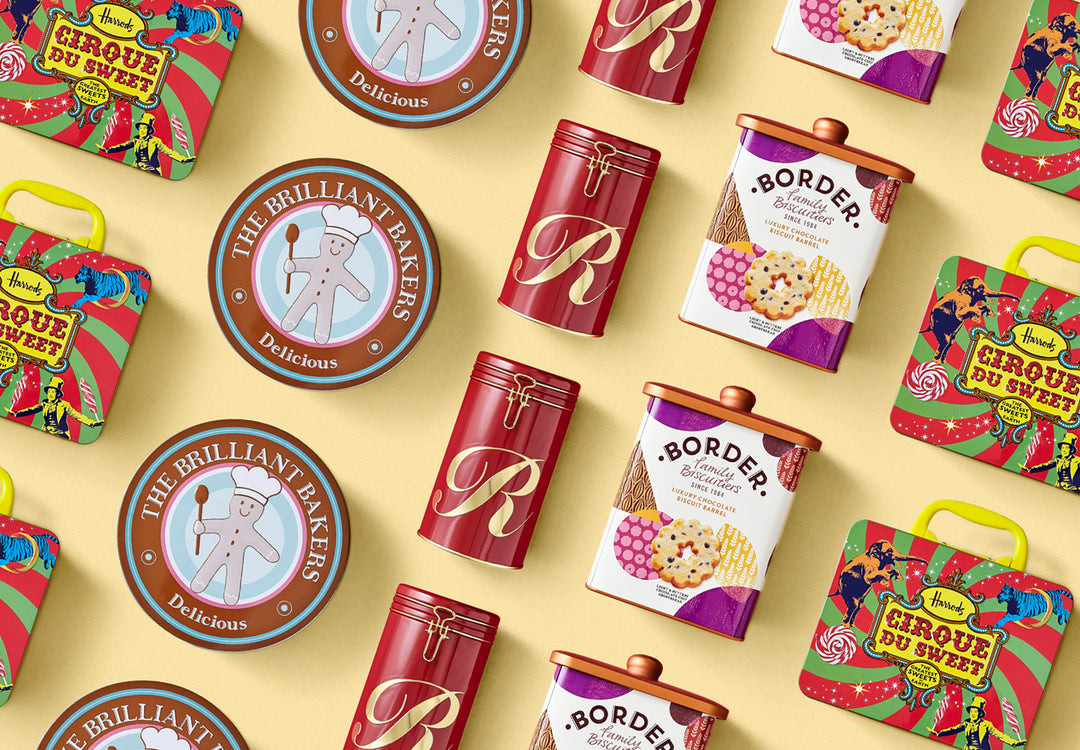
Tinware Direct which also recently achieved ISO 9001 accreditation, launched in 2001. Since that time it has supplied some of the UK’s most prestigious brands. Names such as Harrods, Fortnum & Mason, Border Biscuits, Campbells Shortbread and even Nintendo use Tinware Direct as supplier of their tin box packaging.
It’s not just big brands that use Tinware Direct, many small and medium sized businesses use its bespoke tin service to develop customised tins for their products. Alternatively they select from Tinware Directs wide range of stock tins which are available for next day dispatch and can be labelled or printed directly onto the tin.
As Tinware Direct moves forward with its new visual identity, there is no doubt it will continue to offer its customers superb service and high quality end-user targeted packaging.
